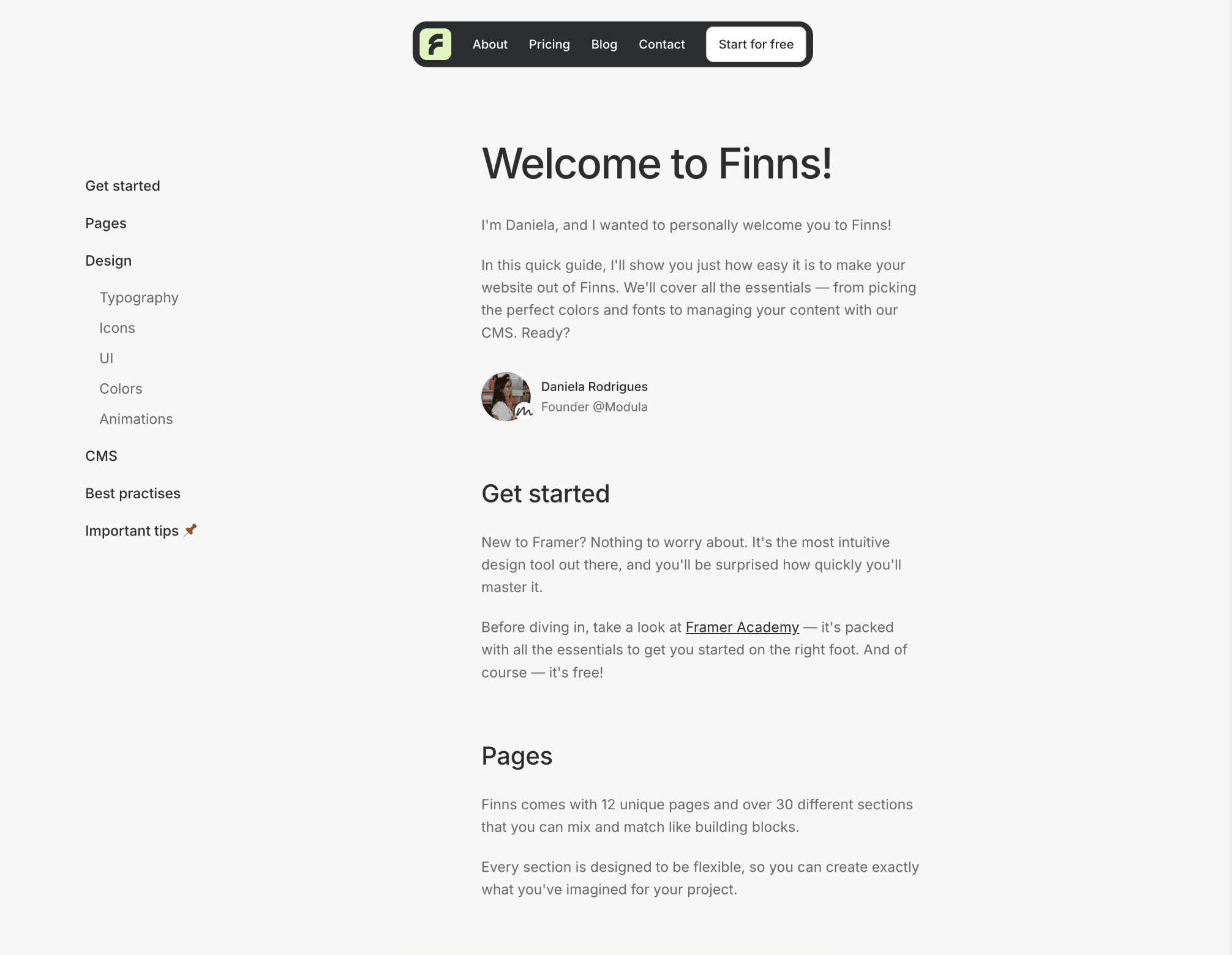
I'm Daniela, and I wanted to personally welcome you to Finns!
In this quick guide, I'll show you just how easy it is to make your website out of Finns. We'll cover all the essentials — from picking the perfect colors and fonts to managing your content with our CMS. Ready?


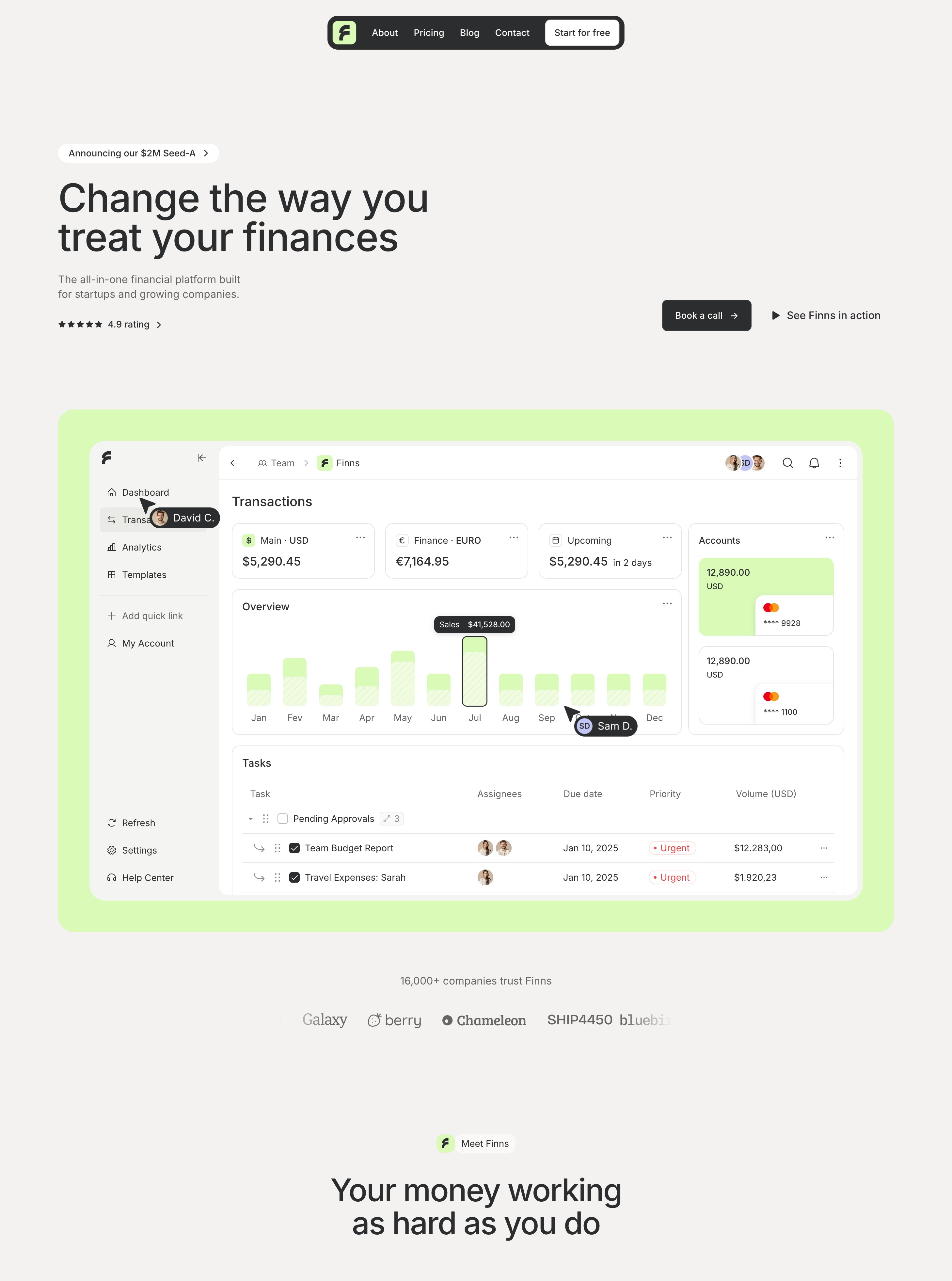
Finns comes with 12 unique pages and over 30 different sections that you can mix and match like building blocks.
Every section is designed to be flexible, so you can create exactly what you've imagined for your project.
Finns uses Inter — a clean and modern typeface that's perfect for tech websites. The best part? It's already in Framer, so you're all set!
Headings
paragraphs
Extra Large paragraph
Medium paragraph
Small paragraph
Here's what makes Finns special: ✨ you can design everything right here in Framer.
Unlike most templates that rely on static images, we let you customize every element - from images to icons to layouts. No more switching between design tools.
For colors, Finns comes with a vibrant lime highlight that you can easily change to match your brand.
Brand
For text and other elements, we have a set of grey tones that help distinguish between primary and secondary content.
Tip: Since these colors are specifically picked to keep your design balanced, we recommend keeping them as they are.
Black
Grey 1
Grey 2
Grey 3
Grey 3.5
Grey 4
Animations aren't just for show — they help make Finns feel polished and engaging. All these small interactive details are built right in, and level up the quality of the website.
We've set up a powerful CMS so you can manage your content without diving into the design canvas. Adding blog posts or changelog events to your software is just a few clicks away.
Here's something really important: 💡 your main canvas is set to desktop size, so make all your edits there first.
Don't worry - your changes will automatically flow down to other screen sizes. This goes for everything - text, images, effects or colors.
Let's keep your site running fast and smooth! Here are some tips for your images:
Aim to keep files under 500KB - your visitors will thank you for the quick load times.
For most images, go with JPG - it's the perfect balance of quality and size.
Need transparency (like for logos)? Then PNG is the one to go.
Your site should look amazing on every device - from phones to desktop monitors. Take a moment to preview your design across different screen sizes to make sure everything's looking just right.